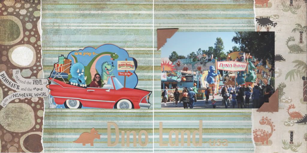
Yesterday I went shopping with my sister which included a trip to Archiver's. On my list were the new Archaic line of patterned papers by Basic Grey for a layout of DinoLand USA at Animal Kingdom.
I wanted the journaling to mimic exhaust from the "car" I was driving into DinoLand.  I used the same steps I shared in my Shaped Text post last November. Unlike creating the Mickey head text, I didn't have a photo of what I wanted. Instead I sketched out the lines on a blank piece of white paper, scanned them into Photoshop and then "traced" with the pen tool.
Supplies: Basic Grey Rock, Dino and Bunny Hill patterned papers; QuicKutz dinosaur and Studio & metro fonts; Making Memories leather frame cut into photo corners; Die Cuts with a View adhesive backed cardstock; misc. tan cardstock; fonts: Garamond, Matisse, 2Peas Crate, 2Peas Silly, and Akbar. Inspired by Apr 14 of dw2008.
4/13/2008
DinoLand usa
Subscribe to:
Post Comments (Atom)


I love your layout is super cool and that is one clever idea, have a great week!
ReplyDeleteLove how you did your journaling. Very cool!
ReplyDeleteadorable
ReplyDeleteI wasn't aware of that paper? Its perfect for your layout! So cute!
ReplyDeleteVery cool how you created a text path to get it to do what you wanted! It turned out great.
ReplyDeleteLove the layout!! You go girl! YOu have been on a roll lately! Dana
ReplyDeleteWhat a cute layout! Love how you're riding in the car! ;-) I haven't seen this line yet...looks great!
ReplyDeleteLove the lo!! The exhaust idea is way too cute.:)
ReplyDeleteI love this LO! TFS!
ReplyDeleteOkay, THIS I could maybe try. Thanks for the idea and tip. And that layout is darling!
ReplyDeleteThis is such a cute layout! I love the car and the journaling.
ReplyDeleteCute cute cute LO..
ReplyDelete