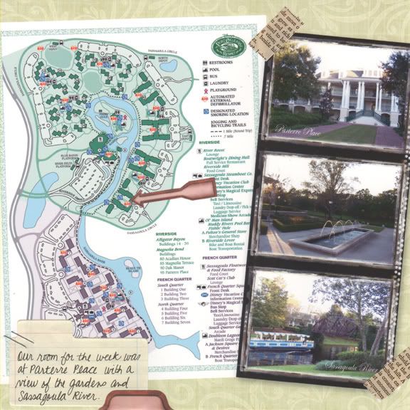
A hybrid layout using a map & photos of the resort we stayed at during our Disney trip.
Supplies: Soft Green patterned paper from Anne Langpap's Free June kit at Two Peas; Photo Edge frame from Rhonna Farrer's Office Supply Tool kit at Two Peas; Edwardian Script font; Heidi Swapp journaling spot & tape; Micron black pen; 7gypsies stickers; staples. Inspired by Feb 12 and Apr 3 of dw2008.
Bluebird Hello
12 hours ago


Cool idea of using the map! Great layout
ReplyDeleteVery cool! I love how you used the map & the arrow!
ReplyDeleteGreat layout! tfs
ReplyDeletecool layout!
ReplyDeleteVery creative!!!!
ReplyDeletegreat pageg
ReplyDeleteI love how you incorporated the map! I did one similar with a Disney resort map...they are great maps for backgrounds on pages.
ReplyDeleteHi, Sarah, just trying to catch up here. You're such a prolific blogger, girl! LOL Cute cat photo, bird nest, and tee shirt bag. Love the mapped layout. I did that on a layout of our trip to Beliingrath Gardens in 2000. It turned out very nicely, too.
ReplyDeleteHad to comment again...because as I looked closer...my family and I stayed at that same resort but in '04. We had been at the Disney Campground but got evacuated for Hurricane Charlie...Disney even closed for part of a day. They never do. Yes, "Wally World" was really closed! (for anyone who is familiar with the Vacation movies!)
ReplyDeleteFabulous use of the map in your layout - and the strip of photos is cool!
ReplyDelete